A Year in the Making: Jewellery and Design Object Exhibition

 A Year in the Making is an end of year exhibition showcasing the works of the first year students from Melbourne Polytechnic’s Diploma of Jewellery and Object Design course.

The exhibition features jewellery and objects constructed in various materials ranging from sterling silver, opals, embroidery, copper, leather to rose quartz.  The exhibition reveals how contemporary jewellery has developed into an art form by combining both traditional jewellery making techniques with artistic practices.  Each student highlights their skills and creativity through creating jewellery and objects that are both wearable and explores the notion of contemporary jewellery.

While viewing the exhibition, the question arises whether contemporary jewellery is wearable.  Traditionally jewellery has been associated with beauty, status, wealth, and fashion that are designed to fit the body.  The body becomes the canvas for displaying small art works or adornments such as necklace, brooch or earrings.  As noted by Patricia Anderson, “contemporary jewellery is different from other art forms such as sculpture and painting only by its scale and its intended setting is the body”.
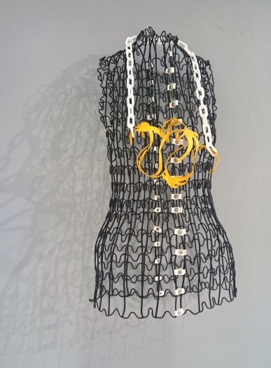
torse

An Ode to Angus Fairhurst, work in progress, 2015, copper, plastic chain and powder coat paint, 215 mm x 15mm (Image by artopticon)

Rachael Waith, Melbourne-based jewellery artist and current student, presents a series of contemporary jewellery that references found objects and materials by challenging the traditional means of jewellery making.  Each piece is designed from a sculptural aesthetic, allowing the material  to tell the story.  Waith focuses on shape and texture in her sculptural work titled  An Ode to Angus Fairhurst, depicting a woman’s torso wearing a bold necklace. The re-construction of found objects and recycled materials is a vital element in Waith’s work.  This theme is transcended onto her jewellery pieces as she reinvents objects and sterling silver to create bold works dictated by form and texture.
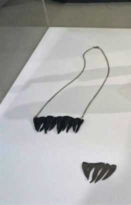
necklace

Teeth Necklace, necklace, 2015, oxidized silver and sterling silver. Titanium Teeth, ornament, 2015, titanium and sterling silver (Image by artopticon).

Each jewellery pieces are placed in a glass case with the bright spotlights to highlight the materials, inviting the viewer to contemplate the art work on a closer inspection. I am drawn towards the Teeth series that is position on the white plinth.  Teeth Necklace is made of sterling silver chain and oxidized silver that are engineered to embody a delicate chain with the inclusion of the carefully sculptured black teeth.  The teeth are shaped in the style of animal teeth such as a lion, adding another dimension to the work by evoking the natural qualities often seen in tribal handcrafted jewellery.
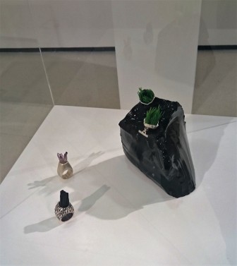
DSC_0656 (1)

 Foreground: #Veracruz, ring, 2015, sterling silver and amethyst points.  Black Tourmaline Baby, ring, 2015, black tourmaline and sterling silver.   On the black stone:  All Flesh is Grass, two ornaments, 2015, plastic found object, sterling silver (Image by artopticon).

Black Tourmaline Baby and #Veracruz are both bold rings that references natural elements and found objects.  #Veracruz explores unconventional forms and nature by embedding amethyst points onto the head of the sterling silver ring, adding to the illusion that crystals are rising towards the skies.  Similarly, Black Tourmaline Baby is a strong work with the inclusion of the long and black tourmaline stretching towards the skies.  The texture and earthy colours of the ring resonates Waith’s passion of Responsible Mining that calls for a system that respects communities, provides safety to the miners, and minimises harm to the environment.

The bold statements echoed from the jewellery art exhibition explore traditional and unconventional form to re-define materials and objects, and to also create wearable art works.

For further information on the exhibition, please visit: A Year in the Making

Gallery: Melbourne Polytechnic Prahran Campus ,Gallery 101 (MB), St John Street, Prahran, Victoria, Australia

Exhibition Dates: 17th November – 25th November 2015

Ryan Carrington: United We Stand

United We Stand exhibition addresses work ethic and labor class of the blue and white-collar workers in the United States.  Ryan Carrington,  an artist and  a sculpture lecturer at San Clara University, uses construction materials, clothing items and chalk drawings to depict different labor class in his recent exhibition at Shooting Gallery in San Francisco.


chalk drawing

Chalk Line Drawing 13, chalk snap line and fixative on plywood, 48x48in.  (Image by artopticon)

The small gallery room has perfectly installed the various artworks in a lightly dim room with a touch of natural light filtering through the ceiling window.  Carrington’s artworks use symbolic materials to comment on class and consumerism.  Each artwork offers its own narrative and communicates a strong message to the viewer, encouraging us to contemplate upon the issues of labor class, work ethic and socio-economics. Carrington comes from a working class family and has previously worked as a landscaper and construction worker.  Through his own family and personal experience “he gained an appreciation for the hard work and dedication of the labor force” (cited: Los Restratos). Manual labor and Carrington’s personal experience is clearly resonated throughout the United We Stand exhibition.

carrington.screw-relief-7burberry-3.24x32.5x3.screws-and-plywood.2800_m

Screw relief 7 (Burberry #3), screws on plywood, 24×3 2×3. (Image from:Shooting Gallery, United We Stand)

Upon entering the gallery space I am drawn towards the ‘Screw Relief Series’ that has been carefully crafted with screws and plywood.  The coloured screws adds to the three-dimensional component of the artwork, allowing us to appreciate the manual labor undertaken by Carrington to construct Screw Relief 7 (Burberry #3).  We appreciate Carrington’s precision and the time taken to construct a symbolic work by using construction tools and materials that he bought from Home Depot.  The use of household commodities depicts the powerful relationship between labor, class, and consumerism.  On closer inspection we note Carrington has crafted a plaid patterning series, referencing the high-fashion luxury brands such as Burberry.  ‘Screw Relief Series’ examines the difference between white and blue-collar worker by combining both manual labor with high-fashion clothing worn by business executives.

IMG_20151028_123253717_HDR (2)

Flag Series: Flag #10 (carpenters pants, suits and neck ties, 68x36in) and Flag #9.  Carpenters pants, suits and neckties, 45 x24in. (Image by artopticon)

The ‘Flag Series’ is one of the most powerful works in the exhibition that is installed opposite of the ‘Screw Relief Series’.  The two symbolic series emphasises the different class system in the United States.  Flag #9 and #10 was created by using the classic American uniform that consists of men’s suits, shirts, collared shirts, carpenter’s pants, and neckties.  Once again, we appreciate Carrington’s craftsmanship as he has sewn the different clothing items together to create the American flag.  Carrington’s intent was to create an iconic symbol to bridge the gap between the blue and white-collar worker.  Here, we see the American flag as a reminder that we are all united regardless of class barriers.   The act of manual labor encourages the viewer to discuss and to empathise with the ever-changing class struggle in the United States (cited: United We Stand).  Reflecting upon the American flag we are reminded of the various communities and the different socio-economic classes in the United States.

Carrington has combined both his artistic practice and construction materials and clothing items to remind us of class and issues associated with the American labor force.

Gallery:   Shooting Gallery, 886 Geary Street, San Francisco, CA

Exhibition Dates:   October 10th – November 7th 2015

Max Kellenberger : Le Scarpe

Max Kellenberger references everyday objects to capture emptiness and melancholy associated with a disposable item.  Kellenberger’s Le Scarpe is the Italian word for “The Shoes” is the latest exhibition that includes 12 large toned cyanotypes at Corden|Potts Gallery in San Francisco.

Kellenberger is a San Francisco-based photographer who works with various techniques ranging from photogravures and cyanotypes.  Le Scarpe’s photographs are each at 22 inches by 30 inches consisting of empty shoe boxes that Kellenberger started collecting 20 years ago.  The collection of shoe boxes is a project Kellenberger began after his wife brought a pair of Italian shoes, and he noted the potential of creating a still life series of shoe boxes.  The shoe boxes featured in the exhibition are from expensive designer shoes, such as Ferragamo that were disposed after purchased.  Sitting in the recycling bin, the shoe boxes become a new artistic project for Kellenberger.

Still life has always been present in art history from Paul Cezanne painting everyday objects such as apples, vases and bowls.  Here, Kellenberger has captured the beauty and internal essence of shoe boxes as a photographic series.  The shoe boxes are elevated to a new dimension through the process of toning, assisting with softening and enriching the typical blue print of traditional cyanotypes.  Kellenberger bleached the images to bring out the highlights, after washing and drying for a few days the photographer was able to see the final colour.

installation view
Installation view: Max Kellenberger, Yves Saint Laurent, 2015, Toned Cyanotype, 22 inches x 30 inches.  (Image from artopticon)

The toning and bleaching process allowed Kellenberger to work with texture, light and shadow to achieve the emotive dimension of the shoe boxes.  The 12 framed photographs are hanging along a white wall with the spotlight pouring onto each image, emphasising the different tonal elements. The light and dark shades created in Yves Saint Laurent portrays a beautiful image of a close up shot of the shoe box’s interior that we easily forget this is actually a designer brand shoe box.   The dark coloured box blends into the background with a tint of light, adding the extra depth into the still life object.  The yellowish/white border also compliments the composition, playing along with the narrative of the once disposable shoe box.

Through the careful lighting and staging of the shoe boxes Kellenberger has created mesmerising images full of emotion and depth.  Contemplating upon the photographs I am drawn towards the close up shot of the shoes box’s interior.  The lighting and dark contrast of the shoe boxes encourages us to draw deeper into observing the object, noting the melancholy and emptiness.  Here, we are no longer observing an object but follow Kellenberger’s emotional journey of creating Le Scarpe.  Kellenberger defines the concept of each photograph as a “…..very personal work about the transience of existence. We walk through life in shoes, and at the end it is an empty box.” (cited: San Francisco Chronicle Le Scarpe Article)

Exhibition dates:  3rd September 2015 – 17th October 2015

Gallery:   Corden|Potts Gallery, 49 Geary Street, #410, San Francisco, CA 94108

Avan Podhajsky: Sarakiniko

Avan Podhajsky’s solo exhibition at No Vacancy represents a mixture of photography and painting, exploring form and colour.

w4 (1)

Avan Podhajsky, Untitled/Sarakiniko, 2015, black and white photograph, 57 x 78 cm, (image from No Vacancy website)

The last two years the emerging artist, Podhajsky travelled through Europe photographing beautiful landscapes and people he encountered along the way.  This exhibition has captured Sarakiniko a tiny beach in Milos Island, Greece that is surrounded by white wind, eroded rocks, cliffs, and rock pools.

The small white cube gallery serves an ideal space for Podhajsky’s nostalgic photographs, allowing the viewer to admire the black and white images that are juxtaposed with abstract paintings.  The series of photographs capture tourists and locals relaxing and enjoying the beautiful island.

At a first glance, the black and white photographs bring an element of nostalgia. Both, the formal elements and subject matter evoke nostalgia as the viewer is drawn towards the people who have departed the city life for a chance of escapism in Milos Island.  Untitled/Sarakiniko (2015) conveys the romantic ideas of relaxation and escapism as we also reminiscent our own holidays and times of joy.   Podhajsky has captured the bright sun glaring down the white eroded rocks while the people sunbake and admire the magical island.  The calm and clear ocean is juxtaposed near the white eroded rock capturing a moment of escapism.

Podhajsky’s photographic style reminds me of the late 1950s and early 60s social documentary photographs that captured everyday lives of humans, buildings, and landscapes.  The dark, grey and white tones transform us back to the formal and aesthetic elements that were often depicted in the late 1950s and early 60s American documentary photographs.  Through the black and white photographic technique, Podhajsky provides us an insight into the life of Milos Island, a stark contrast to the economic and political turmoils in Greece.

Untitled

Avan Podhajsky, Untitled, circa. 2015, acrylic and pastel on wood, 100 x 67cm, (image from No Vacancy website)

Untitled (circa. 2015) is an acrylic and pastel on wood abstract painting, experimenting with bold colours, shape, and technique.  The red, blue, yellow, and green background is inspired by the ocean and the land.  The face that resembles a mask is situated in the centre blends with the vibrant and earthly colours in the background.  Evidently, the juxtaposition of the face and land represents the relationship between humans and the coast.  Untitled (circa. 2015), ties perfectly with the series of black and white photographs of Sarakiniko.

Gallery:   No Vacancy, Melbourne

Exhibition Dates: 11- 20 September 2015

The Nestor collection: Local history, art, and nostalgia

Ray Peace, a friend of mine who is a widely published local historian, photography enthusiast, and Vice President of the Knox Historical Society, was recently gifted an amazing collection of historical photographs. I am honoured to showcase a sample of the photos and share the story behind the collection with the world via this blog post.

The collection was created by Agnes Nestor (1895 – 1982), a professional photographer from Warragul, Victoria, Australia, who worked for Eastman-Kodak throughout the Second World War, and later founded Nestor Studios, based in Ferntree Gully, which operated from 1946 to 1955. Nestor married photographer George Doig in 1946, whose mother was a member of the wealthy and well-connected Barnes family. After Doig passed away in 1955, Nestor moved away until c. 1970 when she returned to Ferntree Gully.

The collection spans from 1917 to 1982 and includes up to 700 photographs, in addition to acetate and glass plate negatives, some of which are undeveloped. The works are predominantly created by Nestor, yet some of Doig’s works are also found in the collection, such as a glass plate negative dated 1911, when George was eighteen years old. The collection also includes ephemera, such as the personal correspondence of Doig, and certificates naming Nestor as the winner of various art prizes. Nestor’s photographs have remained in the family albums of Agnes Nestor’s descendants. Nestor’s artworks are yet to be found.

IMG_20150826_0001Example of a page of a photo album from the Nestor collection (Image supplied by Ray Peace)

The photos were taken in various metropolitan and rural locations in Victoria and New South Wales. The key photographic themes explored in the collection include architecture, cityscapes, night images, sea images, transport, nature, and portraits.

a_nestor220bAgnes NESTOR / Passenger ship leaving Circular Quay, Sydney, Australia (Image supplied by custodian (Image supplied by Ray Peace)

Photographs of large ocean liners document a traditional mode of transport that has been superseded by international air travel. Powered by coal, these ships carried immigrants and cargo between continents.

a_nestor293bAgnes NESTOR / The SS Weeroona (Image supplied by Ray Peace)

The collection also documents the arrival of the US Pacific Fleet in Port Phillip on 1 August, 1925, comprised of the USS Pennsylvania, a dozen destroyers, and the fleet supply ship. The battleship’s float-plane, which crashed in Port Phillip Bay three days later, is also captured by Nestor.

IMG_20150826_0002Examples of Nestor’s photographs documenting the arrival of the US Pacific Fleet in Port Phillip, Victoria, Australia (Image supplied by Ray Peace)

Photographs of iconic city buildings such as Flinders Street Railway Station provide a glimpse into Australian city life during the mid-20th Century. Horse-drawn vehicles, penny-farthing bicycles, and cable cars are an unusual sight for contemporary viewers who are accustomed to seeing automobiles and electric trams in these spaces.

a_nestor65bAgnes NESTOR / Flinders Street Railway Station (Image supplied by Ray Peace)

The strength of the Nestor collection is its inclusion of a broad range of locations and themes. The collection is well-aggregated from a local historical perspective, representing a useful case study for exploring Australian city and regional life of the past.

Several niche sub-themes can be found in the collection. There are photographs of animals that were held in the Melbourne Zoo up to ninety years ago, including the tiger shown below. Though we have not yet uncovered the tiger’s name, we know that she had three cubs in 1925, which were sold to Wirth’s Circus.

IMG_8778a_tigerAgnes NESTOR / A female Bengal tiger in the Melbourne Zoo (Image supplied by Ray Peace)

The collection also includes some rare pieces, such as a photo of the Puffing Billy Railway, which is possibly the only surviving photograph of carriage 16A after it was scrapped due to being in an accident during the early 1930s.

a_nestor210bAgnes NESTOR / NA Class narrow gauge locomotive on the Puffing Billy Railway, carriage 16A (Image supplied by Ray Peace)

Fifteen handcoloured prints painted in watercolour represent a highlight of the collection. These prints provide interesting insight into the beginnings of an art genre that emerged with the invention of photography and continues to flourish today, as showcased at the National Gallery of Australia’s recent Colour my world exhibition.

g_doig_nestor13bAgnes NESTOR / Portrait shot of Nestor Studios (Image supplied by Ray Peace)

Though handcolouring was a common technique in the absence of readily available colour photographic film, Nestor’s work demonstrates a talent for bringing the prints to life with arguably more depth and vibrancy than could be achieved through a colour photograph. Nestor had a flare for complementing already well-composed shots by skilfully layering watercolours to build up rich intensity of colour.

Ray has worked with the collection since 2006, digitising and indexing 344 images, following recommended standards for scanning and image retouching as far as was possible with the technology available at the time. Likening the digitisation process to a Ken Burns documentary, Ray commented that working on the collection “was like entering a vanished world.”

Long-term conservation is challenging for a private collection that has not been housed in the facilities of an official collecting institution. Some photographs have been damaged from abrasion, in addition to showing signs of emulsion bleeding. The work that Ray has undertaken in digitising, cataloguing, and researching the collection to date, on purely voluntary basis, is extremely admirable.

Just who was Agnes Nestor? We haven’t quite uncovered her full story yet. Researching Nestor and Doig is somewhat challenging due to an unfortunate lack of primary source material, with the majority of records destroyed in a fire at the Knox City Council Civic Centre building in 1994. Nonetheless, the Nestor collection represents a case study with huge research potential from a local historical perspective, in addition to an art historical perspective, given that Nestor was a local community artist of Melbourne during her time.

Nestor was given a camera as a gift for her 21st birthday in 1917 and never looked back. Agnes is captured below, showing a timeless elegance and beauty, with her folding camera in hand and canine companion at her feet.

g_doig_nestor6bAgnes NESTOR / Agnes in the back garden (Image supplied by Ray Peace)

I would like to extend a special thanks to Ray Peace for supplying me with the information and images that informed this blog post. On behalf of a descendant of Nestor, Ray is currently in the process of donating the Nestor collection to the State Library of Victoria. Ray is also looking to publish a book on the collection in the coming years.

You can find Ray’s Flickr page here.

Murray Fredericks: Origins

Murray Fredericks’ latest exhibition at Arc One Gallery presents a body of work depicting raw elements at Lake Eyre, located in the deserts in South Australia.  Fredericks is a Sydney-born photographer that has captured his personal journey in remote locations across the Middle East, the Himalayas and Australia. The large-scale coloured photographs take on fire as the main theme in the Origins series.  The monumental prints depict the powerful forces of nature to create a dramatic perspective of Lake Eyre, using fire as the focal point to connect us with the universe.

Upon entering the gallery the large-scaled photograph Muybridge (2015) is placed directly opposite the entrance, depicting a tree set alight against the night sky. The strong flame attracts my gaze to the photograph’s focal point, appreciating the aesthetics and technical composition.  The lightly dim installation highlights the earthy tones of the flame, encrusted salt and landscape evoking the powerful and meditative state of nature.   Fredericks’ focus on the flame adds a dramatic element of the universe, capturing a transformative moment in Australia’s landscape.

Origins

Installation view of Murray Fredericks’  Muybridge, 2015, Digital Pigment Print on Cotton Rag, 120 x 160 cm, and Salt 405, 2015, Digital Pigment Print, 105 x 250 cm, Arc One Gallery. (Image  by artopticon)

Along the side walls, a series of large-scaled photographs depict the amazing spectacle of the Milky Way.  The digital pigment prints of the Salt series (2015) were also taken at Lake Eyre with Fredericks looking out to the cosmos, capturing infinite space and time. The mesmerising photographs of the stars transform us into a deep contemplative mode by observing the cosmos and infinite space.   Here, we are transported to a moment of sitting underneath the stars in the middle of the night, looking out to the heavens without any concept of time and our materialistic surroundings.

The dynamic contrast between fire and galaxy connects us with our personal and universal origins through Fredericks’ depiction of nature’s raw elements.   This encourages the viewer to stand and reflect upon the mesmerising images captured by Fredericks.

Reflecting upon the photographs we are able to appreciate our peaceful land and connect with Fredericks’ determination to capture a serene moment.  Instead of capturing a didactic view of landscape the photographs evoke an emotional connection between nature and humans. The Origins series is an emotive interpretation of our universe indicating that nature plays a reflective mood for the viewer to transcend into another realm.

Gallery:  Arc One Gallery: 45 Flinders Lane, Melbourne VIC 3000

Exhibition Dates: 25 August – 26 September 2015

The cats of Heide and Halcyon Days

On a recent visit to the Heide Museum of Modern Art, I learned that John and Sunday Reed, patrons of the Heide Circle artists and owners of the property that now accommodates the Museum’s exhibition spaces and collections, were cat people. That’s right, crazy cat people!

A current exhibition showing at Heide I titled Halcyon Days: Heide in the 1940s features a photo album formerly owned by the Reeds and now held in the Museum’s archival collections that is filled entirely with photographs of the cats of Heide. Due to the difficulty of safely displaying this type archival object, patrons are restricted to viewing only a single spread of pages from the album, which was arranged by Sunday Reed in a scrapbook style. One photograph shows the son of Albert Tucker and Joy Hester, Sweeney, who was later adopted by the Reeds, playing with the cats. Above the stove in the kitchen room of Heide I is a strip of decorative tiles featuring illustrations of cats, bringing the viewer a great sense of the warmth and love that the Reeds held for their pets.

It was intriguing to see that the cats of Heide do not feature in any of the artworks displayed in the exhibition, though at least one study of the Reeds’ pet dog is included. It does not appear that cats were ever a common subject in the works of the Heide Circle artists. A brief investigation yielded only a single piece by Danila Vassilieff, in which a cat is represented albeit is not central to the work. The piece is from Vassilieff’s series of gouaches dedicated to the folk tale of Peter and the wolf that are held in the National Gallery of Australia.

Vassilieff - Peter and the wolf
Danila VASSILIEFF / Peter and the wolf: the wolf swallows the duck and stalks the bird and cat / 1948-49 / drawing in watercolour and gouache / 27.8 x 42.9 cm / National Gallery of Australia (Image retrieved from the National Gallery of Australia’s online digital collection)

From the exhibition, I learned that the Reeds owned up to twenty cats at a single time! They were allowed to roam freely through the house that is now Heide I, yet were restricted to the confines of a cattery whilst outside, due to the Reeds’ consciousness of the impact of cats on the environment. The cattery has been preserved and is located for viewing just outside of the Heide I building, accompanied by a label informing the viewer that the cats were the real owners of the property. It is said that a hierarchy existing among them, with cats of the Siamese variety ruling at the top! The cats of Heide were able to move between the house and the cattery via specially designed cat windows.

Photo of cat window at Heide I
Photo of cat windows leading to the cattery at Heide I (Image retrieved from Heide Museum of Modern Art’s educational resource on the Heide Sustainability Art Trail)

heide-siamese-kitties
Photo of Siamese cats at Heide / from the archival collections of the Heide Museum of Modern Art (Image retrieved from Heide’s Facebook page)

In addition to these interesting glimpses of the feline occupants of Heide during the 1940s, Halcyon Days includes examples of the beginnings of Sidney Nolan’s Ned Kelly series, Arthur Boyd’s early experiments in surrealist landscape, Danila Vassilieff’s paintings of children, Albert Tucker’s photographs, and Joy Hester’s psychological portraiture. St Kilda, a suburb that the Heide Circle artists were fascinated with and often frequented, features in several of the works shown in the exhibition. One of my favourite pieces from the exhibition is a photograph of Joy Hester at St Kilda beach taken by Albert Tucker.

Tucker - Joy Hester at St Kilda beachAlbert TUCKER / Joy Hester at St. Kilda beach / 1945 / photographic print: gelatin silver / 40 x 31 cm / State Library of Victoria (Image retrieved from the State Library of Victoria’s online catalogue)

Whilst attending the exhibition, I discovered that patrons can also walk around in the library room of Heide I, viewing the Reeds’ extensive personal collection of books on a range of topics, including poetry, European modernism, revolutionary political ideologies, gardening, and cooking. There is also a display cabinet containing an issue of the Angry Penguins broadsheet, incorporating the macabre motifs Albert Tucker explored in his Images of Modern Evil series, alongside a copy of Reg. Ellery’s Psychiatric Aspects of Modern Warfare, a work grounded in psychoanalytic theory that influenced all members of the Heide Circle throughout the years of the Second World War.

Tucker - Angry Penguins broadsheet cover
Albert TUCKER / Cover of 1945 issue of Angry Penguins broadsheet / 1945 / Heide Museum of Modern Art (Image retrieved from Heide Museum of Modern Art’s educational resource on Albert Tucker)

Nolan - painting on cover of Reg Ellery book
Sidney NOLAN / Painting featured on the cover of Reg. Ellery’s book (Image retrieved from aCOMMENT blog)

To me, the strength of Halycon Days is its effectiveness in truly immersing the audience in the world of art and love that existed at Heide in the 1940s, whilst showcasing the birth of Australian modernism. The exhibition achieves this by giving viewers the freedom to move around in the very spaces in which the Reeds and the Heide Circle artists lived and worked, as well as revealing the more quirky and personal aspects of their lifestyle, in addition to providing a glimpse of the literature that influenced their thinking and artistic practice.

Halcyon Days is showing until 13 September, 2015. A $16 ticket gives you access to all of the exhibitions that Heide has to offer.